Thursday, March 19, 2009

Interactive Design : Great Web Design Examples

Pieface.com.au
This site allows a viewer to engange in both visual and audio interaction, and also have the ability to draw all over the page with a colour that looks suspiciously like tomato sauce.

Coca-cola.com.au
Full of colour and a spring in its step, a viewer obtains a response from the site as things move when they are hovered over with the cursor.

Step by Step Description : Making Toast

1. Wash hands.
2. Ensure toaster is placed on a hard, flat workspace (i.e. benchtop).
3. Plug toaster into nearest electrical outlet.
4. Turn electrical switch on.
5. Place a fresh slice of bread into a dedicated slot, located on top of the toaster.
6. Observe toaster setting - change dial to a medium setting.
7. Push Big slider on front of toaster down [IS IT STAYING DOWN?]
8. Wait for toast to pop back up.
9. Give toast about half a minute to a minute to cool down before retrieving from toaster.
10. Check colour of toast [IS IT GOLDEN BROWN IN COLOUR?]
11. Toast is ready to serve.
12. Switch off at powerpoint.
13. Serve toast with desired spread.

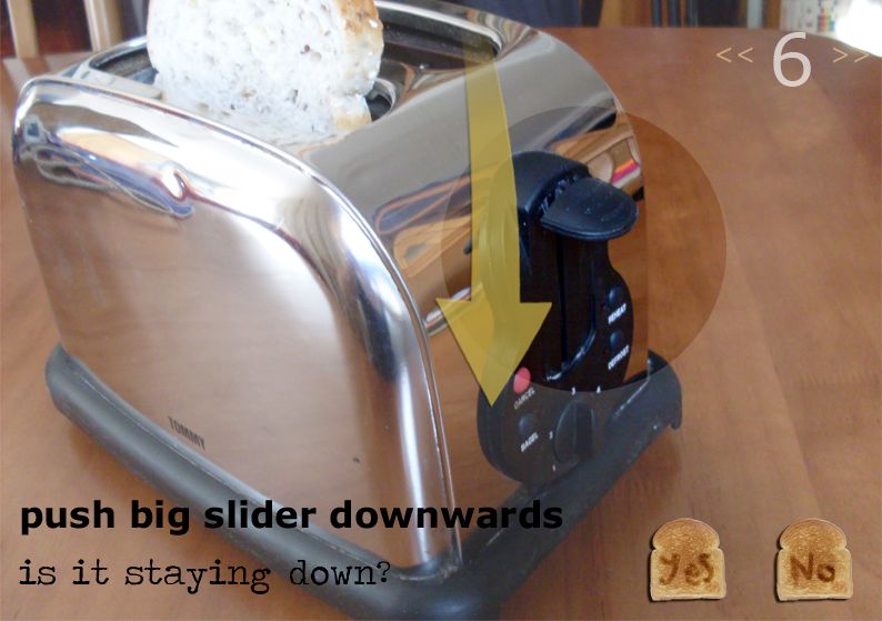
Storyboard Images : Making Toast


[click in image for larger view]


[click in image for larger view]

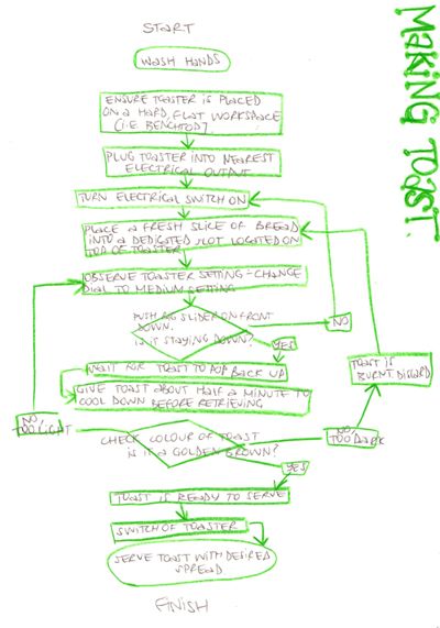
Flowchart : Making Toast

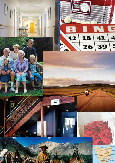
Mood Board

"John is a 75-year-old retired carpenter who still enjoys hikes in national parks and riding his Harley-Davidson. He looks forward to the local club raffle and a catch up with the boys on a Thursday evening. He also enjoys playing bingo, listening to local radio and watching old western movies with his wife Jill. As he gets older and has to visit the hospital more often, he prefers quick and efficient healthcare with simple, bold instructions and hospital signs. He aims to enjoy the rest of his life traveling a little and spending time with family, especially his grandchildren."

Wednesday, March 18, 2009

Interactive Design : Definition

In order for an interaction to occur, one must so something and then be given feedback on their action: a re-action. One could be satisfied at this this definition, but the rabbit hole goes a lot deeper than that.

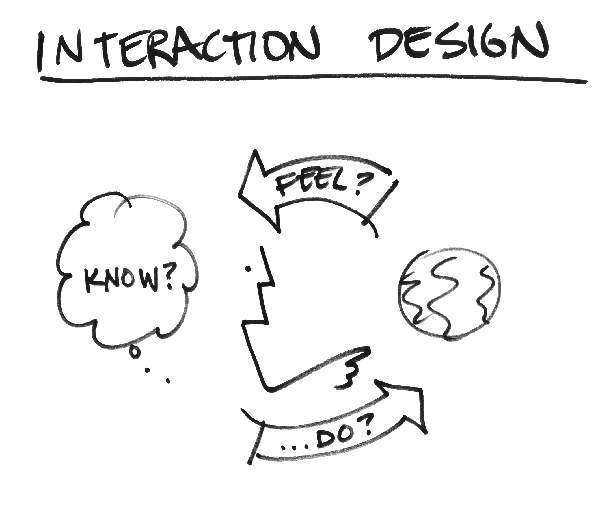
Interactive design looks around creating something people can work with, delving into media such as mobile phones and the internet. Therefore, the context and a study of proposed audience in which one is designing for is very crucial for the design to work effectively in order to obtain the correct response from a user. For an interaction to be successful, a user will gain an emotion from the experience. Bill Verplank's lecture on interactive design explains this using brilliant information graphics to inform and engage his audience:


image from billverplank.com

The lecture goes on saying that there are three fundamental questions to be answered when interactive design is concerned:

"How do you do? What sort of ways do you affect the world: poke it, manipulate it, sit on it?
How do you feel? What do you sense of the world and what are the sensory qualities that shape media?
How do you know? What are the ways that you learn and plan (or perhapse, how we want you to think)? "

[quote from billverplank.com]

Information/ Instructional Design : Examples

mesü bowls
image from hostessblog.com

Mesü Bowls
These bowls were designed in mind of the growing state of obesity within the Western world, but manage to inform an eater in a subtle and non-intimidating way of the amount they are eating. Circles in pastel colours are located on the side and inside of each bowl symbolically representing the designated amount that can fit into each bowl, starting at 1/2 a cup and going up in increments of a 1/4 all the way to two cups. It is informative, yet makes portion control for dieters not so in-your-face.


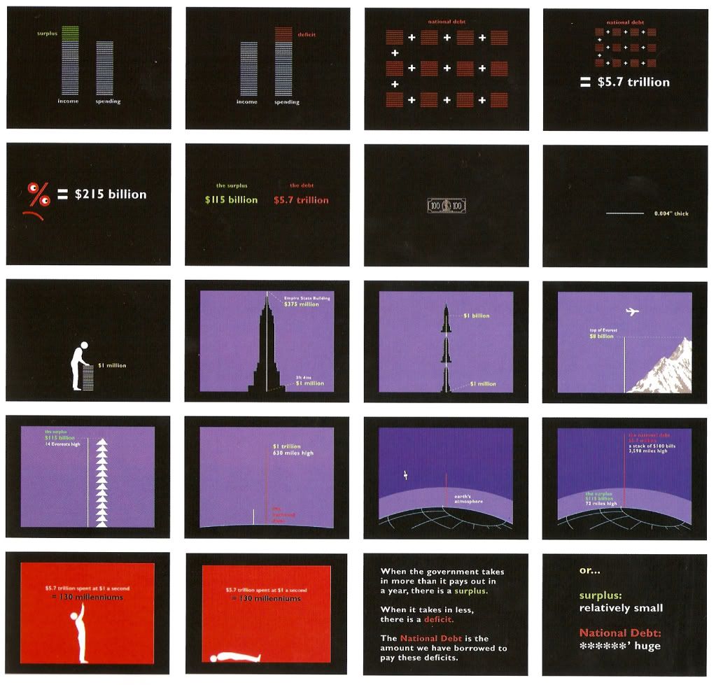
The Surplus and the Debt
[click on image for larger view]
Image from the Information Design Handbook


The Surplus and the Debt
To make a somewhat incomprehensible and complex topic such as the economy and the monstrosity of national debt into a topic that is easier to understand requires a lot of simplicity and perhaps patience with a sound grasp of the general knowledge known by the targeted audience. This selection of screenshots from the short film by Explanation Graphics, The Surplus and the Debt, breaks down to using symbols to explain things at the most fundamental level and builds up from there, relating it to objects that one can visualise in order to make a comparison of the quantity they are explaining. All in all, it uses almost a quirky sense of humor to make sense of a topic that effects us on an international scale and yet is generally not very well understood.


airline safety cards
image from airlinesafteycards.be

Airline Saftey Cards
For something as in the case of an emergency on an airplane, there is no room for error when it comes to saftey, particularly no room for miss-interpretation. Developed for passengers of the B737, the storyboard layout of the emergency instructions uses minimal words for the instructions to avoid having large amounts of text for translation as well as colour highlighting to pinpoint important descriptions. It easily bring the message across to any passenger no matter what language they speak in a very clear and concise manner by categorising the type of emergency and the actions to take in such an event.